Monday, March 29, 2010

Risky artists and their arts

This week's theme was Experimentalism and the Avant Garde. It was about artist who are ahead of their times, creating art that is edgy and taking risk with their art.


We first looked through some slides of artists 'creating their art'.

Most of the art i saw on the slides is not in any forms that can be seen, they are to be experienced. This concept is new to me, i have never tried this method in making art yet.


I found it interesting, as this method itself is risky and adventurouse. As i belive that everyone is different, and have our own different way to look at things. It's different with more visual subjects such as sculptures or paintings, where they are considered as 'art' universally. There's less potential for a sculpture/painting to be seen as boarder-line art.


However, Experimental art have the quality of taking the risk of playing with the idea around 'what is art', this method is indeed risky as it can be something that is viewed as art by one person, and concidered nonsense by another. It would not be an object to be touched, but more of an experience or a memory to grasp. So the 'art' is gone as the performance ends.


From the slides, what really struck my attention was the performaces, Rhythm by Marina Abramoovic and How to explain pictures to a dead hare by Joseph Beuys.


Beuys coated his head in honey, then covered his headwith gold leaf, hold a dead hare in his arms, walked around the gallery telling the hare about the consciousness of human and animals. He believes that a dead hare have more understanding and appreciation of the works than humans.


Tessa explained that this performance deals many symbolic connotations in the ways he presented himself.


So i did alittle research on the meanings behind his use of materials:


“In putting honey on my head I am clearly doing something that has to do with thinking. Human ability is not to produce honey, but to think, to produce ideas. In this way the deathlike character of thinking becomes lifelike again. For honey is undoubtedly a living substance. Human thinking can be lively too. But it can also be intellectualized to a deadly degree, and remain dead, and express its deadliness in, say, the political or pedagogic fields. “Gold and honey indicate a transformation of the head, and therefore, naturally and logically, the brain and our understanding of thought, consciousness and all the other levels necessary to explain pictures to a hare: the warm stool insulated with felt…and the iron sole with the magnet. I had to walk on this sole when I carried the hare round from picture to picture, so along with the strange limp came the clank of iron on the hard stone floor—that was all that broke the silence, since my explanations were mute… “This seems to have been the action that most captured people’s imaginations. On one level this must be because everyone consciously or unconsciously recognizes the problem of explaining things, particularly where art and creative work are concerned, or anything that involves a certain mystery or question. The idea of explaining to an animal conveys a sense of the secrecy of the world and of existence that appeals to the imagination. Then, as I said, even a dead animal preserves more powers of intuition than some human beings with their stubborn rationality. “The problem lies in the word ‘understanding’ and its many levels which cannot be restricted to rational analysis. Imagination, inspiration, and longing all lead people to sense that these other levels also play a part in understanding. This must be the root of reactions to this action, and is why my technique has been to try and seek out the energy points in the human power field, rather than demanding specific knowledge or reactions on then part of the public. I try to bring to light the complexity of creative areas.” - Beuys.


I thought it was very clever and logic with using the honey and the gold leaf, as well as the animal. However without research i would have no understood the symbolic meaning that his performance holds. Therefore i thought his work was really taking a risk with the audience, as many would not have comperhend his intensions, though i personally thought the performance would be intersting to witness in person regarless.


The performance by Marina Abramovic was greatly facinating as well as alittle disturbing.


It reminded me alot of the topic last week on woman being the 'submissive object'.
The artist allowed the audience to do whatever they liked to her with the 34 objects provided, as she stood there being the 'object'. This thought of mine was reinforced when Tessa told us that when the Abramovic stood up and started walking towards the audience, the crowd was immediately frightened. That backsup the point of women are often regarded as being passive, but she will be feared if she start to confront.


After the slides we headed for the Gallery in relation for our theme on Experimentalism art.

This is the 4th Auckland triennial and the theme is: Last ride in a hot air balloon. The theme reminded me of the movie 'Up', which is a movie about taking risks, going onto an adventure in a 'balloon house'
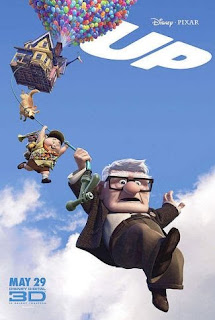


This theme itself is about taking risk and explore new ways to create an idea with art. Hot air balloon is a metaphor for adventure and freedom; and that is what this collection of arts are exploring.
I thought most of the art fitted into the theme rather well, as they are all bringing a new way to make a statement in their work.
The works i really enjoyed were The room with a bird by Bundith Phunsombatlert, the work dealed alot with the idea around freedom with the window being as part of the show, and Alicia Frankovich's Revolution (Martini Fountain), which was to show a visual metaphor for life.
I especailly liked Singing cloud by Shilpa Gupta. It's a large cloud shaped sculture that was made of 4000 microphones with audio of humming comming out of some selected microphones every now and then. The idea of the artwork was exploring the feeling of fear. I thought had brought forward the idea, as when i first saw the large black shape, i got the connotation of gloom/dark/fear. The artwork itself have direct link with the theme of the hot air balloon, as it's in the shape of a cloud. I thought the artwork is rather successful as it did inflict fear in me up on seeing it, however the other artwork Untitled (split flap display board) was alittle confusing for me. Words appeared on the board about deathes. I didn't quite understood what it meant, though the words that appear on the board was depressing.
Another work i liked was Revolution (martini fountain) by Alicia Frankovich. It's a pool of liquid mixure of water and martini with a hoses that circulates the liquid through the martini bottles hanging at the centre. This work is a metaphor presentation for blood circulation which symbolizes life. The hanging form of the bottles are reminders for a hospital IV. I didnt understood the idea upon seeing the work, but with explaination, i found the concept of the sculpture very clever.
The experimental art style is something i never came across before. And im not too sure if i fully understand the view on creating experimental art yet. But the concept seems interesting and it would creat more impact on people, I'l like to expand my ideas and try at some point.


Monday, March 22, 2010

Gaze

This morning the topic we looked at was Feminism and the 'Gaze'


Tessa talked about the aspect of how women are usually presented now adays, through films/popular culture (TV) and the conclusion is that women are often shown being the ideal - to men. As the main visual engagement of the modern society today is from what we see in movies or musical MTVs, we see women on the screen often from the aspect of a 'male gaze'. Females character are always shown to have the qualities of being a male fantasy. This may or may not mean that the actual face of the woman is shown, therefore she becomes an object simply to be looked at while the viewer can not get to know the character as a person, nor can the character return the gaze. And this can have an different effect on the female viewers, as they wont be able to relate to the character, since the character is mainly designed for a male taste of an 'eye candy'.


This idea relates to a word that Tessa discussed with us - Patriarchy.


It means a community where men are in power of everything. I think that the media today is indeed dominated by the 'male gaze', as this talk reminds of just how shallow that the popular culture is nowadays. In my own experience, when my boyfriend and i go watch a movie, we'd always discuss the main character's love interest of the film, who we generally refers as being the 'hot chick/guy of the movie', and if this 'chik' or 'guy' is not 'hot' enough, we automatically think that the movie is not 'perfect'. We are brainwashed by the concept of the 'male gaze' to think that everyone on screen should be visually pleasing, regardless their actual skills in acting or the story of the film. This is mainly influenced by the dominance of male directors and modern popular culture.


Tessa then showed us slides of the artworks that deals with the concept of feminism and the idea of scopophilia.


I really like the art work by Babara Kruger - 'Your gaze hits the side of my face'. It really relates to the the idea of feminism and the male gaze. It is the female's point of view on the 'male gaze' The profile photo of a female bust, symbolizes that fact that she can not return the stare, as she is just seen as an object. This reinforces the idea of 'men being the subject, while female is the passive object'. While in the book 'The explicit body in performance', as the writter explains that on page 90, that the 'gaze' from the viewer can be seen as a form of desire for the female's body.


http://books.google.co.nz/books?id=Nsorf98pWGkC&pg=PA90&lpg=PA90&dq=your+gaze


Another art work that i really enjoyed was by Linda Nochlin, Buy my apples, buy my bananas. There was humor in this peice of art as well as the clear indication the different reaction we get from seeing a naked female to a naked male. This is flipping the concept of a 'male gaze' where a nude woman was shown, to a female point of view, where a man is being exposed. Females through out the century were more commonly exposed by media and art than males. So therefore we are more inclined to accept, or even to say more comfortable to see an image of a nude woman than a nude man.


After the slides we studdied a section of a film by Hitchcock - Vertigo.


Tessa explained that the film is about an ex-detective, traumatised by the death of his work partner, now was asked by a friend to spy on his wife, who was suspected to be in a strange mental state.


In the film we see that the film is projected from a man's perpective. This was indicated through the camera presentation of the female character. The female character was never shown facing the camera as she's not aware that she's being watched, also she was often shown from the back like she's being followed from a distance.
We as the audience only see what the detective sees, and when he sees. So clearly, we are watching the film, as well as following the female character through his eyes.
Additionally the female figure is always focused to be in the center of the frames, constantly cutting back and forth with close up shots on the face of the detective, with his eyes being the main focal point. From this we get a clear indication that we are seeing the female character through the eyes of the detective. Here the detective is almost like a 'peeping tom' which reinforces the idea of the 'male gaze' we talked about today.

Feminism art movement was not something i know much about. I had teachers that suggested me to create art in the style of a feminist, especailly for my Art design class where i chose to sexualize the traditional fairytale female characters. As in the original stories they holds alot of sexual connotations. It was an exciting concept to work on, and my teacher really liked the idea and was glad i chose something that was really quite different from others. However because i had little idea about feminism art, and not enough time to fully understand it, i did not reach the full protential of the topic i chose.
Today's talk was really helpful for me, as it introduced me to feminism art and the idea of 'gaze'. Which will benefit me to produce better artworks than before.

Thursday, March 18, 2010

Language and art

This week we looked at the close link between language and art. It didnt occur to me before, but after seeing some of the slides that Tessa showed us, i was introduced to just how close the links between our language and the art world. What got me thinking was the Semiotic theory Tessa mentioned. Where as Semiotic breaks down to the signified and the signifier, which are the thing and the thing describing the thing.
From the slides, I really liked the art by Rene Magritte-The treason of images. He combined language in the painting itself, 'This is not a pipe', suggesting this is only a picture of a pipe. It is stating the obvious, but he used the element of text along with the image of the pipe together, giving the viewer a clear statement of what the painting is about, abit sarcasm almost. In addition, we also looked at some different languages from different cultures. As some of the ancient languages like Egyptian/Chinese are written, almost to say 'drawn', by the word's meaning. This is where the text itself links tightly to art.

After the slide show, we as a class went to see art that deals with texts and art. We went to the talk of 'Unpacking my library' . The artists that interested me alot from the talk were Dan arps, Elizabeth Mcalpine and Bill Culbert. Thier works reinforced alot of what we talked about in class prior comming to the gallery.

One art I especailly liked was the artwork by Elizabeth Mcalpine. Which is an on going incomplete collection of post-cards featuring the London tower. Some of the cards are really old, black and white photos; and some are more recent. Each post-card have the photo of same landmark (London tower), however in each card the tower clock points a different minute. So when the collection is lined up, the clock would read the time of the day in order from morning to midnight. I think it's very clever to use the sense of time and images together to form an artwork like what Mcalpine did, and it's also very interesting how the old post-cards are mixed in with the new in the time order, so it gives me a sense of jumping back and forth within time when looking through the images.

I was rather inspired by what we did this week, to try something like this in my own practice maybe.
I always wanted, also was told that i should try to do some artworks that combines text and images together, to give a stronger sense of statement for my art. I found what i learnt this week quite useful, as it showed me alot of ideas that used images and text together.

So this is where i can build my ideas for my own art practices from.

Tuesday, March 9, 2010

5 Things i love


For contexual class this week, we looked at the things that interested each one of us as individuals. Tessa showed her favourites with us and i really liked her art work 'Kundalini is a Girl', as she explained that she love to play around with colors and the idea of the spiritual being being female, giving it a feminist feel to the artwork. We were given tasks to read through 'Ten good reasons as well as Nicole Cherubini's 10 favourites. It is very interesting in seeing what inspires these artists, so in response, i made my own list.


Here is 5 things that inspires me for the art style im working in, or want to improve in.


1. Bioshock


Bioshock is a game by microsoft for both xbox consel and PC. The reason for my love for this game as well as the sequel - Bioshock 2, is because of the strong Art deco element used in the game. Both in the architecture design and the ingame art. I am a big fan of the early 1900 up to 1950 Art deco/ vintage styles and Bioshock series provides a great feast of art featured in the game. I love how the creator, 2K, have combined art in a video game successfully.


2. La belle dame sans merci (painting)


My favourite painting of all time, is this one by John William Waterhouse. Whom is famous for his beautiful paintings of greek/celtic mythology as well as literature such as poems and shakespeares.


This painting is illutrating the poem La belle dame sans merci, which is my favourite poem. The poem is about femme fatale (dangerous woman who lures great men to thier doom) As can be seen in the painting, a beautiful woman is sealing the fate of the helplessly in love knight. The painting is rich with meanings, as it is full symbols. Such as the color of the woman's dress, the pose of the knight. All in wich are symbols hinted within the poem.


3. Alphonse Mucha


As Art Nouveau being my favourite art style, Alphone Mucha is my favourite artist.


Infact he was one of the artist who contributed in the making of this art movement. Most of his paintings are used for advertisments of the time, as photography was not used back then. I love the use of lush flowers teamed with beautiful figures of this style. The sleek flowing line works are so wonderful, as this style was described as 'a crack of a whip'. So within this type of art, it is both elegant and chaos.


In addition, this illustration is on my mug. I was so happy to find a mug that have an artwork that was done by my favourite artist.


4. BattleStation midway Pin-up poster.


This is my absolute absolute favourite poster i have on my wall. It is a poster for a video game. I had it for almost 3 years now and it is still my favourite. It is WWII pin-up themed, again it is in the style of the 1950s which i am a big fan of. There are other poster versions for this game, with different female figures with different military roles, like airforce/ medic/ navy etc. But this is the one i brought. I dont think i will be replacing this poster anytime soon.


5. Imagine FX magazine.


Last but not least, this is my favourite read at the moment. This is a monthly magazine, so every month i buy an issue. They have helped me so much with my illustrating techniques, both traditional medias as well as digital medias. Imagine FX not only features tutorials and tips, they also show alot of design pages, which i found useful in expanding my ideas at times.


Thursday, March 4, 2010

Week 1 - Fastfood Nation

We watched a film called Fastfood Nation directed by Richard Linklater for contexual studies.
The film provides very realistic views of lives of people from different backgrounds, which alot of the students found dull. I too, was alittle bored by the too true 'everyday life' story, but i am also touched by the truthfulness. As the title suggests, the film deals with the lives of people working in the business of Mickeys (a fastfood brand very much like McDonalds), but from different perspectives in the different job areas. The movie is giving quite an unti-fastfood messege, by the negative connotation of the mood of the film. As seen in the film how animals as well as the immigrant workers at the slaughter house are cruely treated and not look aftered. An research shown that most injuries to the workers in the slaughter houses goes unreported and most are sent back to their home countries after becoming crippled. Before watching the film we discussed that the film have an 'fracture' connotation contained within. As the machines are taking over the modern world, people and their skills are needed less and less, mostly replaced by emotionless machines resulting that we are becoming more detached to reality more than ever. From seeing the film, the 'fracture' connotation do stand strongly and was presented by the character Rudy Martin. As he asked Don to open the gate for him, Don said 'you should get a clicker' Which shows how much human today depends their lives on machinery instead of what they are capable of doing themselves. However i personally feel that the there's another idea that contridicts the 'fraction' in society. As the film depicted just how closely neted that the society is. As seen in the movie, Sylvia was working at the same hotel that Don stayed on his business trip, such coincidence. However he'd never know the tragic lives like the kind this hotel maid and her husband leads, nor would he ever know that her husband works at the very slaughter house that provides the meat for Mikeys and the dark secrets that place hides. Though all from their different point of views, they are all working for the same company and discovering a same horrible truth. That is how corrupted the society is and they are all victims.