Tuesday, August 10, 2010

Eldon Booths- reality and illusion.

Blog question: 'using film terminology, discuss Eldon Booths exploration of reality and illusion.'


This week's topic was on Moving image by Eldon Booths. I have never done moving image before and have never met Eldon till Monday's class. So it's quite inspiring to have a lecture by someone that began as an art student just like us now. Through his study he have developed a love for writing scripts, and he dedicated his practices on his fascination of the idea on blurring the difference between 'reality and fiction'.


He began by explaining realism in terms of making a footage. Realism is an illusion created by shooting from a 1st person view, making the character a very personal subject. This technique manipulates the viewer to think that they are viewing reality. Eldon mentioned some of his critics, among which i have heard of Ramond Williams and Marion Jordan.

I found the critic that Marion Jordan did on Coronation Street rather humorous, as i am not a fan of the show, shame to say i even find it hard to watch, because the lack of exciting plot for the story to a point i see it as a show for seniors. However as Eldon explained, that is why the series is successful in capturing a vision of reality. Jordan stated in her essay 'Realism and convention', that Coronation Street is based upon working class characters, average everyday people that the audience can relate to, as well as a real location that people might have been to or lived in. This manipulates the audience into seeing the story as believable, as they would feel like they are watching their own everyday lives.

http://www.jstor.org/pss/1225036


There's many ways of portraying reality, conventional dramas like Coronation Street is a common method, where the audience is seeing from the camera's point of view, here the audience is all knowing. This is done by the counter shot format, which is done in continuity editing style where the camera cuts back and forth from characters. Eldon moved on by showing the class a short clip from E.R as an example of the camera editing. the reality is obtained from the illusion of realism, because the camera is not noticeable.
However E.R did an 'Ambush episode' that is completely different in techniques, the ambush episode was done in the style of a documentary.
Eldon mentioned a book by media scholar John Fiske - Television Culture: transparency vs Reflection, where Fiske explains that conventional dramas are the 'Reflection', that allows the audience to relate the roles of the characters, and documentaries are the 'transparency', that opens a window to the world.
http://books.google.co.nz/books?id=UttKCZIHsR8C&pg=PA21&lpg=PA21&dq=television+culture+john+fiske+transparency+reflection&source=bl&ots=d8oG-P29PM&sig=sM82KjLqXh7kyS9OS6Xqe2XSx_U&hl=en&ei=IRFmTK-NJ4jQsAOek4n3DQ&sa=X&oi=book_result&ct=result&resnum=1&ved=0CBkQ6AEwAA#v=onepage&q&f=false

Documentary is another way of projecting a vision of reality. Noted in this particular episode there are blurred focuses, lower grade of stock making the image noticeably lower quality, erratic pans of the camera due to the camera being most likely hand held and the lack of editing, lastly and most importantly the camera now becomes apparent. Characters become 'aware' of the camera and the fact they are being filmed, therefore acting unnatural, as well as making eye contacts with the lens.

which links to the next video Eldon showed us and it was a work by him. In this footage, as Eldon explains, he was using 'amateur' filming technique. The 'Amateur' method is just like the name, it doesn't require much technical skills. By using natural sound/music and following at the back of the characters, very much in the style of a documentary where as the audience in the place of the camera is the observer. There's also a use of a split screen that emphasis on the biological deterioration by comparing the grandson with the grandfather. Even though they are shown doing very different things but also very similar, like the connection in drug use, the grandfather in bed near the end of his timeline and the change in landscape.

Just like traditional paintings, modern media also evolve in trying to capture realism. Though i am unfamiliar to this topic and I have never done any moving image related practices before, i do look forward to it as it seem like a new and interesting way to explore realism through more technical approaches with modern technology.


Tuesday, August 3, 2010

Dion Hitchens- Interaction and collaboration

Blog question: Select at least 2 of the following terms and discuss in relation to Dion Hitchens's practice.


Interaction


Collaboration


Site


Cultural/history


technology (kinetic)


This week we had the lecture from Dion Hitchens about his life of sculptural practice. I have yet to have the opportunity of being in Dion's class, therefore it was very interesting to see what style his works are like. I am not familiar with 3D object making, and i have never done sculpture before, so the content of the talk was new to me. I found interaction, collaboration and site qualities very strong in his art works, and to me it is very effective. I would like to explore the above two elements relating to Dion's art making.

Dion began by explaining his inspiration for his practices, which is the Post modernism movement. This is especially important to him, as he said that he is 'thankful' that his works would be recognized and accepted by the public, which was not a thing in the past when there was alot of prejudice from western culture against non-white ethnics. Consequently Dion's works deal mainly on Maori history, in areas that he try to connect the audience physically, emotionally as well as spiritually.

I feel that there's alot of humor in Dion's sculptural installments, that allow the viewers to communicate with the work. The humorous nature of his art are often brought in by the use of technology, providing the work with unexpected movement that surprises the audience. Giving the first work he mentioned was shown in a window display. It was 3 pieces of steel forms in a glass case that oscillates while creating a soft humming sound as it moves. The way the work was installed in a window display, which in Dion's favor, was an excellent way to present the work. The audience does not need to be inside the gallery to respond to the installment. This creates a mix type of audiences: the archetype art critics/admirers that are the usual visitors of galleries and the people passing by in the street that might have never stepped in the doors of a gallery their whole life.


The work i liked the best out of all was the Patupaiarehe (faries of the forest)


Similar to the first piece he mentioned at the beginning of the lecture, this sculture also have movement. The motion done through the trigger of a sensor. As viewers walk into the room the sensor set off the figure in the photo to move. I thought it was funny when Dion told us that this work made some viewers jump, to a point that one of the other figures were knocked over by a viewer out of fright.


Dion's techniques in using the 'unexpected movement' quality is really effective in making the audience react to the work, connecting the viewer with the art work.
Another element which i thought was very interesting was his way of making use of the location where the art gets displayed.
Like in the first work of the 3 steel pieces oscillating in a glass case, site plays a important role. Just as the piece of reading talked about the relation between the art and space, as well as art using the space as a form of enforcement, 'defined primarily as an agglometration of the actual physical attributes of a particular location...with architecture serving as a foil for the art work in many instances. '
This links to the work he have situated in G.I. A form that resembles a mountain made out of steel that connects the idea of the other cultures coming to live in the area and bringing their memories along with them to the new land. This deals with how the community interact with space as well as the artwork itself.
It is interesting that i thought how closely linked the element of interaction and site of Dion's works are, as each of the two qualities seem to present the other.
Additionally from the talk i really enjoyed the idea of having really good mates that would help me in the making of my artworks (not home works of cause) like Dion.
Many of his works are products that he made with his friends that is specified with a skill that would help with the materials he is constructing the artwork with. I also found that his collaboration with his friends also connects with the idea around interaction, in case with friends.
At the end of the talk, Tessa presented the work that she worked with a good friend artist which i liked alot. There was many thought and effort put into the constructing and the presentation of the work. Here the site is an important issue too, they decided to shield the work away from the public behind tall plants, however that rise another problem as many mischiefs takes place in that location as it is seemingly a popular place for drug addicts and homeless people. I hope that they would spare the artwork.
Although i know nothing of sculptures, as it is not part of my interest, Dion's ways of making his artworks seem very fun and also meaningful in context. I found it my weakness in writting about sculptures, espeically contemporary works. However I really like how he embrace his roots and getting his works that he made with his friends out there to the public through the interaction he have with the audience and the site. I feel that for scuptures especially, collaboration, interaction and site is the most assets and Dion's works are successful in bringing the togetherness of the community and connects it with the works with spiritual meanings and humor.


Monday, July 26, 2010

Rebecca Hobbs - Absurd and Imperialism

This week the lecture was given by Rebecca at her Gallery show - Failing, Falling, Flying.
It is fascinating to see the practicing side of a lecturer that had taught me before, and learn what aspects of life inspired them to make their own art. Especially when i am most inexperienced the field of photography/media.

Upon entering the show, i saw the footage of Ah-round first. I did not understood the hidden meanings in the work, but i liked the skillfully used camera techniques, and wondered if it would be used to enforce the idea behind the work. After Ah-round, i moved on seeing the works displayed at Failing, falling, flying.
One element i really enjoyed was the interesting titles of each work. The choice of names are short and clever as it suggests alot of movement, which is effective as most of the photos are action shots.
Rebecca then went over telling us about her years of practice, which answered alot of questions in my head when i first viewed her art. Many of the works are made overseas during her studies in L.A. The work i like the best out of all is a short filmed footage - Tumbleweeds, 2004
http://www.videoartchive.org.au/rhobbs/weeds.html

Rebecca told us that this was shot at Pioneer Town in L.A. I was alittle confused and frightened at first, people rolling on ground out of no where in an empty town is a scary image that reminds me of alot of scary movies (like spider walk on the stairs). However after awhile i start to find it quite humorous and silly.

Humor is a very important element in Rebecca's work, and one of the main influences in her practice. Her works are largely based on the ideas of 'Absurd' and 'Imperialism', and i choose to talk about the 'Absurd'.
Rebecca states that Absurd to her holds the idea of 'Strife to find meaning in the world, but never been able to find it.' She was inspired of this idea from Sisyphus, who was punished by god to forever be pushing a huge boulder up a hill, the rock then will roll back down; therefore repeating the process for eternity. Rebecca combined this idea of the ambition to find meaning with humor. She said that alot of her earlier works are commonly played upon dirty jokes, because there's so very little meaning that they hold, and that is why the names of her works are rather raw and literal.
I find the way Rebecca explain her perception on 'Absurd' interesting. She talked about the absurdity in relation to Irony and Slap-stick, and the three are closely linked and the difference is fine lined, which is written in the essay by Peter Shand - I'm walking backwards for Christmas. In the essay Shane also made a reference to the 'myth of Sisyphus' in relation to the idea of absurdity. My favourite quote of this essay was 'Absurd actions take on an independent existence that have nothing to do with their goals.' - this perfectly describe the waste of endless effort of trying to find an answer in life. The essay also mentions one of Rebecca's favourite artists: Bas Jan Ader, and his work of him riding on a bicycle into a canal, in which is another example of the Slap-stick humor.


Another artist that Rebecca was greatly impacted by was Roman Singer.
Singer is a Switzerland artist that does mostly photography and videos.

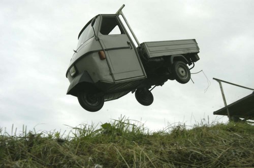
The frozen in time action 'slap-stick' shots is indeed very similar to alot of Rebecca's works, and after seeing the works by Singer, especially this one with the car leaping into the air, i begin to come to better understanding of the question that Rebecca talked about: 'when is the meaning created?' I start to wonder the same if the meaning was actually created long before the vehicle was started? Or was it when the car started running? Or maybe it's when the car ran off the road? It is indeed a meaning that no one would be ever to find no matter how hard you try.
http://www.romansigner.ch/en/start/

I was never good at photography, nor do i think i would ever be good at it. It is not something i am particularly interested in. However Rebecca's talk about 'Absurd' have given me new ways of looking at meanings in art as well as our world in general. Her way of looking at the means of life is very new to me and also inspiring. I would like to make works that creates a question that maybe no one can have the answer of. Though sadly i don't think it would be photography.

After Rebecca's talk we were to go to the Auckland art gallery and pick our own winner. To be honest, i did not understand at all what the works are about, as i could not relate the title to the work. This made it very difficult for me to choose, however i found the work 'Something Transparent' (please go round the back) by Fiona Connor quite interesting. I like the structure of the work, as it looked rather architectural. The title of the work was also quite witty, as i realised after viewing the work i can see the installation from the front and back. Connor's work was the only the one that i thought was quite creative.

Tuesday, July 20, 2010

Mary Curtis - Objects

Blog Qustion: Explore the relationship between function and decoration in the works of Mary Curtis with relation to her process, and the presentation in exhibition: Meta - decorative.


--
This week we are looking at objects with our lecturer Mary Curtis, who is also a well known contemporary New Zealand jeweller. I am personally not very familiar working with 3D objects, so Mary's talk was very interesting for me.


Every artist gather inspirations to work into their art, and Mary is a collector herself. She collects everything that holds interest to her, mostly everyday household objects. Sometimes it could be things that most of us would consider as rubbish, she would see the beauty and potential in it's form to become a piece of jewellery.

Like this champagne bottle cage she found at a wedding is now a pendant.


I really liked the slide of the collection called 'An inordinate fondness of beetles'


This is a collection display at Oxford University Museum of Natural History.


The sight of a beetle usually make me cringe, however this display brings out the beauty in the insects, the colors and the shine of their bodies is almost jewel like. The shine illuminates each individual beetle, as in Mary's words 'the light on the objects bounces off eachother...'

This made me realise that although building a collection does not require any construction of skills, is the most important part of making art, as it is the source of inspiration. Collecting lets you see things in a different way which brings out the visual elements of the object, that you may have never realised before.

Mary then moved on talking about Function vs Decoration in terms of objects, which is the central

In the slide picture of the painting of Queen Elizabeth I which is all about the notion of display. The intense style decorative fashion in the era of the painting restrains comfortable physical movement, therefore it's not practicle, but it is a display of beauty and wealth.

This concept inspired Mary with her works greatly. Many of Mary's works are made from everyday consumables, however turning them into jewels. I really like the use of materials in her jewelleries shown at Meta-Decoration. The print of the wallpapers are very victorian styled. At the same time wallpapers holds the connotation of being a form of decoration, Mary use it to decorate one's body. However unlike the traditional way of decorating the body, where only the rich can afford, Mary's jewelleries are made of inexpenssive modern house-hold materials.


My favourite piece of work from Meta-Decoration is the Green Blanket necklace.

She showed us photos she took of the forever changing workspace of hers while she stayed at Munich.
It is very interesting to see the photos because it shows a process of thinking and trials, the blanket pieces are constantly being moved around and repositioned.
For Mary this is the equivilant of concept drawing.
It is very important because this is the step where she had to deal the function side of the decoration. During which, she had to figure out how would this piece be worn on a body, how the body will be changed by this piece of decoration.
I am personally not familiar with Jewellery making, so it is very intriquing for me to see this experimental thinking stages that deal with function physically.
While looking at Mary's design style of the Green blanket necklace reminds me one of my favourite jewellery designer Tina Tarnoff.


Tarnoff is well known for her use of printed paperart in her jewelleries.


When we went to Meta-Decoration, i understood why Mary was very stressed over how things are displayed. Every piece of Mary's works were displayed in a glass case, hanging from very thin hanging structures. I think it was very effective because the works are positioned up-right at eye-level height, as i stand infront of the works i can picture how it would look on a body.
I found Mary's talk very helpful. Working with 3D objects is not my strong area, however I am very keen on learning jewellery making. From this lecture i am interested in trying new ways of constructing ideas to make art, i like the idea of making a 3D 'drawing'.


Monday, May 17, 2010

Capital and commodity

This morning's discussion was on capital and commodity.


Tessa explained the social concept of capitalism as a 'false economy', today the mass reproduction of goods which brain washes cosumers. This social structure is seen as one person's gain is another person's loss. As we are gainning goods for cheaper, the workers that made the products in developing countries are being paid less.


We veiwed through some slides of artworks that explore the fields of the capital and advertising.


The humor of the first slide interested me.


Slide no.1 Les Animaux de la Ferme, 1974 by Marcel Broodthaers. Upon first look, i didnt quite understand the idea, as it was two of the exact images, 2 of the same cow chart with name labelling under each cow. The humor appealed to me, when Tessa explained the names under each cow is actually different brand names of cars, and in the olden days, cattles are the symbol of wealth, equivalent to the status symbol we see with cars. This artwork is descired as '...looking at the way classfication system function...' in the book Modern Art: A critical introduction by Pam Meecham and Julie Sheldon.


http://books.google.co.nz/books?id=uprSdxUJ1N4C&pg=PA5&lpg=PA5&dq=les+animaux+de+la+ferme+marcel+broodthaers&source=bl&ots=yCQVVwQoOa&sig=cW3GZe7q43MaeqtOlPn82l8mFHA&hl=en&ei=NkDyS-_eBISgswOV8Z2PDg&sa=X&oi=book_result&ct=result&resnum=9&ved=0CDAQ6AEwCA#v=onepage&q=les%20animaux%20de%20la%20ferme%20marcel%20broodthaers&f=false?id=uprSdxUJ1N4C&pg=PA5&lpg=PA5&dq=les+animaux+de+la+ferme+marcel+broodthaers&source=bl&ots=yCQVVwQoOa&sig=cW3GZe7q43MaeqtOlPn82l8mFHA&hl=en&ei=NkDyS-_eBISgswOV8Z2PDg&sa=X&oi=book_result&ct=result&resnum=9&ved=0CDAQ6AEwCA#v=onepage&q=les%20animaux%20de%20la%20ferme%20marcel%20broodthaers&f=false


Even the word 'brand' originated from the marks owners burns on their cattle's skin, to mark the ownership. The repitition of the images side by side is exploring the ideal about the modern mass reprodcution in the art world, everything is a copy of a copy.


This reminds me of the artwork by Andy Warhol - Big Retrospective painting, 1979


Warhol's artworks are the best example of mass reproduction in repitition of the commodity style prints.
The artwork is very industrial wich links to the ideal of capitalism, where everything is mass produced in factories with under paid workers from foreign countries.


The second slide, The Store by Claes Oldenberg interested me in the way he manipulates the consumer minds. Oldenberg set up a shop and made all the displayed content out of the same material, as he descirbes the whole thing as a 'super texture super-collage'.


‘I find it quite natural. to work under the conditions of American technical civilisation. I know every effect, every result of the technical working processes and I believe I can control them.’ - Claes Oldenberg.

The objects in the 'Store' can not be brought, as they are not real. It can be seen as a resistance from the items themselves towards the consumers.
'The ‘political’ dimension, on which he set his sights, consequently lay in a return to the non-alienated craftsman’s existence of a pre-capitalist economy in the midst of an American society based on the division of labour. In the art world of The Store there was not a single thing that he could not potentially have been able to produce and sell.' - Michael Luthy Archiv
This work explores the idea that the modern capitalism economies can trade everything with money still there are things that could not be brought, and objects can say no to being purchased.
http://www.michaelluethy.de/scripts/claes-oldenburg-the-store-history-of-sculpture/

Tessa then showed us abit of the film- They live, directed by Carpenter, John.
To me it gave a very dominant social political message about the domination of the advertisments and how it is brainwashing the society, because the commercials are clearly telling us what to do.
The rich and consuming citizens in the movies were shown to be zombies undercover. What interested me was when Tessa stopped the film when the old lady (zombie) said, 'we got one that can see...'
This made me want to watch the rest of the film.


For our blog question today is to look at an AD in detail in terms of how it works, since we are dealing with the art in the consumer world.


This is a tobacco advertisment of the 1950s i found in the book 'All American ADS'


This ad have used a very classic element of promoting it's product, which is using a well known figure, in this case Marlene Dietrich, who was a popular actress and singer at the time. This technique will make consumers want to purchase from this brand because of the words from this celebrity backed up by her reputation and fandom, 'I smoke a smooth cigarette -Luky Strike!'


Additionally the actress is posed in a chair, giving a connotation of elegance and class, which is appealing to the audience, as if this is showing what you will be like if you consum and use this product.
This advertisment not only use visual techniques but also convincing worbal techniques. Statics and research proof is being used here, and consumers tend to trust the words from a lab proven message.


However, one thing it failed to mention is which legitment orgnisation had done the research.


The color choice here also play a good part to compliment the ad to the viewers. Red Black and white is the dominant colors, again reinforcing the simple elegance, also giving it a very formal appearance with the bold colors. The veiwer's eyes will be drawn towards the red letters then to the red logo on the cigarette package. So it helps the eyes to move around between the visual objects to the texts and around to the actress.


The simple colors are also well used for the foundamental need, to make the reading easy for the consumers.


So it is successful in it's appeal to the crowd.

This week's topic is really useful for me as i will be dealing with some of the commodity art in my up comming essay, where i would be exploring the role of woman in ADs. Additionally im keen to watch the rest of 'They live' in my spare time, as it looks like a very entertainning film with a very strong moral to drive the film's motif.

Monday, May 10, 2010

Materiality, Surface, Affect, Site.

This week's topic covers the concept around materials, surfaces, affects and the locations; these are the 4 elements that is essential for artists to compose their artworks.

Firstly, Tessa discussed what the word Materiality means. Materiality is materials, she explained it's the 'stuff' that artists acknowledges that they are working with. In art language, it's often refered to as Media. I liked the quote that Tessa gave us of Marshell Mcluhan, 'The medium is the message'.
We viewed through some slides of works that are by artists who explores the idea around the materials they use in their art, here the content becomes irrelavent, and it's the form and what made the art that matters.

Slide no.1 by Rene Magritte 'ceci n'est pas une pipe', is a very classic example of looking seperately at the media and the content. Magritte is playing with the idea round the 'treachery of the images', confronting the viewers the obvious that this is only a picture of a pipe and is not the actual object itself. Therefore the content (which is the pipe) here becomes disregarded and the actual materials that made the painting becomes signified.

I was really interested by the works from Rohan Wealleans, Slide no. 9 and 10.

Wealleans really explores the limit of the media he use to compose his artworks, and his artworks fully emphasis on the power of the art material. He construct forms out of layers of house paint which then he carve into showing the almost organic looking layering of colors. He have been discribed as ' a maximalist with an orgiastic approach to materials, breathing new possibilities into the age-old problem of what to do with paint...' - Emma Bugden from Art & Australia magazine. I was also very excited to have found a critique from Tessa in this article as well, as she states 'The sin of appropriation, as committed by Picasso, Gauguin, et al., is here reappraised and perhaps resuscitated.' -Tessa Laird
http://www.artaustralia.com/article.asp?issue_id=189&article_id=209


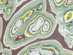
A picture that came to my head when looking at the layers of paint being carved into was the paint fragment that was found in Belmont Art Park in Los Angeles. (also known as Graffiti Art Park).


This fragment is 1cm thick and shows the build up of paint over many years. Different to Wealleans's works where he layered the paints himself, this fragment is made up of paint layers from different people accumilated through years and years, almost to say it's a form of community artwork.
I like the way that this artform was made unintentionally and at the same time explores the idea that media itself is the art.

Continuing down the slides, we moved on to looking at the qualities of surface.

The work i liked the most was Marilyn Monroe by Andy Warhol, it's also a very iconic piece. I really like the machine made quality to the work. I liked the way that Tessa explained the artwork is 'moving away from the hand of the individual to reproduction.' This work not only shows the flatness surface quality of the work, it also explores the superficial surface of the rich and famous. I wasn't able to find the quote that Tessa told us in class, but i found another quote that i rather liked, and to me it shows just how shallow the superficial can be.
'If you want to know all about Andy Warhol, just look at the surface of my paintings and films and me, and there I am. There's nothing behind it. ' -Andy Warhol


One album cover of Madonna shared extreme similarities with the style of the Marilyn Monroe prints, with the usage of flat, bright colors. Which is ironic as this is also a picture of a celebrity.


Tessa then discussed the word 'Affect' as sensory experience. It's the impact upon viewing, that cause senses through out the body. The word is almost always used when talking about art.


I wish i could see the Flower house by Sara Hughes in person. As it's such an amazing scale of work, with warm bright colors, combined with movement. It would be like walking past a wave of flowers. The over whelming swam of colors reminded me of a work i came across in class before by Wolfgang Laib. The bright yellow flower pollen he was carefully laying on the floor, the big square of bright yellow would have been a very amazing sight.


The last topic of the day was Site. Site is where the artist work, could also be where the artist present his/her art. This is very important as to some artists the location is part of their work. My favourite work from the slides is Spiral Jetty by Robert Smithson, 1971. The work is forever changing due to the tide and the salt in the lake, but what is truely remarkable is the artwork is now part of the nature, it has become apart of the scene. I found an analysis on the location and the artwork,

'Smithson built "Spiral Jetty" in the country's saltiest lake. He chose a site called Rozel Point on the northeast shore because he liked the dark pink color of the water, an effect that results primarily from bacteria and algae that grow there. ' - Melissa Stanford.


this make me think a street artist Edgar Mullar.

Mullar uses the pavement as his canvas. Seeing his art also linked back to the idea around 'Affect', as his works tricks your eyes and gives the viewer a 'wow' experience.


This week's discussion was really interesting. Im really amazed at what the artists explore with their art, and to think that the material alone can be the art is a fresh concept to me. It also make me more aware of the importance of the choice of material, surface, impact and location when creating an artwork. Which are somethings i need to put in more thought when i make my own pieces.
Note to Tessa: I wish to base my essay on the topic male gaze, i want to discuss how are women portraited visually in men's favor and the impact on women today. So i'd talk alittle on Erving Goffman's study on body language in 'Gender Advertisment'. Im still working on researching on Kristian Burford and Yvonne Todd.

Wednesday, May 5, 2010

Mythologies and Science Fiction.

This week's topic is about one of my favourites: dreams and Sci-Fi.

We talked about the link between dreams and mythology, as mythology is based on what people fantasize in their dreams, which is supported by Freudian theory of the 'conscious and unconscious mind'.

What interested me at the beginning of the class was when Tessa explained the difference between archetype and stereotype. As these two elements are just about used in all the Science fiction medias. Prior to the class i thought there's no difference between the two words, even after the explaination from Tessa the line between those two words is still blurry, as both of them share a common meaning, and that is the representation of an ideal type. I came to a better understanding of the words after i did alittle more digging on the internet for the difference between the words,
'-An archetype is the typical example of something, or the "original" for a number of "copies."It also is used to describe a universal symbol, e.g. heart = love.


-Stereotype is an oversimplification of something, or taking something "unique" and reducing it to one or two generic traits.'
http://www.answerbag.com/q_view/129238


Tessa then showed the class some slides that deals with the concept of dreams, mythology and Science fiction. I find it facinating looking at slide number 4. Robing the Bride by Max Ernst. Ernst being a supportor of Sigmund Freud's studies, incorperated many of ideas from Freud and used them in his painting. He was dedicated to making 'art of the unconscious'.

This work is interesting also for the time it was painted, which i think had an effect on this work. Around the time this painting was created, Ernst was having several love affairs, despite the fact he have a wife and a son. One particular relationship he had was with another surrealist artist Leonora Carrington. Maybe she was an idea used in the painting??


http://www.brooklynrail.org/2005/05/artseen/max-ernst-a-retrospective5/05/artseen/max-ernst-a-retrospective


In the painting the woman figure is transforming into a bird like creature, similar to the half human half bird like creature on her left, this links directly to Egyptain mythlogical beings. A reason for the usage of birds was the memory of the death of his pet bird on the same night that his sister was born.

'confounding the images of human beings with birds and other creatures. The bird part is a symbol of freedom, and free will, while the human part represents the superego, focusing on control' - Max Ernst
http://gallagherseniorhonors.blogspot.com/2008/05/creative-mind-and-life-of-max-ernst.html

After the further research, i understood the idea of the link between a one's unconcious mind- dreams, creates inspirations and fantasies.

This connects nicely to a more modern fantasy concept, in slide number. 18-21 by Cao Fei.
here the models are dressed up as cartoon characters, though looking like they are from another world, and living out their fantasy, overly cramped apartment lifestyle and heavily polluted city scape in the distant background is the reality that they are living in.

May the Fourth being 'Star Wars' Day, we analysed the original movie (1977). The character i wish to study on is Luke Skywalker.
The character to me is a representation of a classic hero, an ideal 'stereotypical hero'.

The Stereotypical classic hero will always bare some of the following qualities:
Young, good looking, brave and ambitious. However often uncertain before their 'wake up call', they are seen as too strong headed, naive or not ready to fight yet. Sometimes, even unwilling to be involved in the situation, as the character might be traumatized from similar events or simply dont wish to get into the violence.

Luke's character was seen in the beginning of the film as being a dreamer, who desires adventures. The scene with the twin suns setting the horizon captures that fantasy/dream like world of Luke Skywalker. An event will occur that will set the classic hero to a quest, which will be the main drive of the plot for the story. The event often being the slaughtering/ endangering of the character's family member(s), concequently setting the character off to revenge and battle the evil. On the hero's way, he/she will encounter very stereotypical characters, like Obi-Wan Ben, who is the classic wise old man, similar to characters such as Dumbledore from Harry Potter or Dandulf from Lord of the Rings. This character will provide as a guide for the hero on his path, more than often they are the ones to provide the symbolic weapon for the hero.
In the first Star Wars film, the quest was for Luke to become a Jedi Knight, after the death of his uncle and aunty.


A character that comes straight into my head is Jonny Rico from Starship Troopers (1997), directed by Paul Verhoeven. Similar to Luke, Jonny was a dreamer, he dreamed of being a hero and do humanity proud, but his determination was put in doubt after the death of a team mate, loosing his courage he was ready to return home, it is then his home was destroyed and his family was killed that sparked his quest to revenge his parents.

Almost every story of a hero will follow this pattern, and their motive will be engine that drives the plot. Some of my favourite film references of the classic hero that all follows the same pattern are Red Sonja (1985) by Richard Fleischer, Daredevil directed by Mark Steven Johnson, Elektra by Rob Bowman, Clash of the Titans (2010) by Louis Leterrier.

All the above films feature the linear pattern of the Classic hero and conquers evil.

A game worth mentioning on this topic is Mass effect 2, where the game itself is very much like a movie, and you are playing as Commander Shepard, who is the hero/heroine (gender and appearance by player's choice). What kind of person Commader Shepard choose to be is completely by player's choice, and each choice will contribute to how your story ends. This game really explores the 'Hero' character in depth, it lets you feel what it's really like as a hero, how people treat you and the weight you carries on your shoulder knowing that lives may end by consequences of your choice of action.


(unfinnished painting of my Commander Shepard)


I really enjoyed this week's discussion on concept of Mythology and Science fiction, and i was interested in learning about the connection it have to the Freudian theories on the 'unconscious mind', which is the start of Surrealistic artists. I am a fan of Surrealism art and Science fiction, and wish to compose the dream like fantasy elements into my own practice.